Cantaloupe
product design & brand identity
-
Cantaloupe is a food inventory and meal-planning app designed to reduce household food waste and encourage sustainable habits.
The project included full concept development, brand identity creation, user experience strategy, and high-fidelity mobile interface design.
The objective was to create a digital product that makes sustainability practical, intuitive, and visually engaging for everyday users.
-
Food waste is a global issue, yet household waste often stems from simple friction: forgotten ingredients, poor planning, and lack of inspiration.
The challenge was to design an app that:
Feels effortless rather than instructional
Encourages behavioral change without guilt
Balances functionality with visual warmth
Simplifies complex inventory tracking into an intuitive experience
The product needed to feel helpful, not overwhelming.
-
The identity combines freshness and clarity with a friendly, approachable tone.
The name Cantaloupe evokes natural color, nourishment, and warmth — positioning sustainability as inviting rather than restrictive.
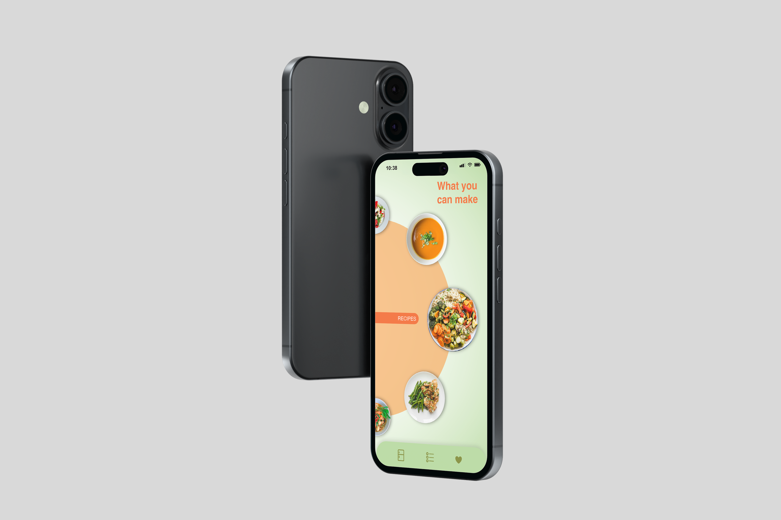
The interface emphasizes visual inventory management, allowing users to view ingredients as an illustrated fridge or pantry, as well as in structured list and gallery formats. Expiration tracking and reminders reduce cognitive load while supporting smarter consumption habits.
AI-powered recipe generation transforms existing ingredients into actionable meal ideas, reinforcing the app’s core value: use what you have.
The UI system balances clean layouts with soft color accents and rounded forms, creating a digital environment that feels organized yet human.
The result is a cohesive product ecosystem that merges brand, interface, and functionality — positioning Cantaloupe as both practical and emotionally engaging.