Relish
brand identity system
-
Relish is a fictional Canadian food and lifestyle streaming network developed as a full brand identity project.
Positioned as a modern, eco-conscious multimedia platform, Relish delivers contemporary programming focused on food, fashion, travel, beauty, and home — designed for a tech-savvy, culturally engaged audience.
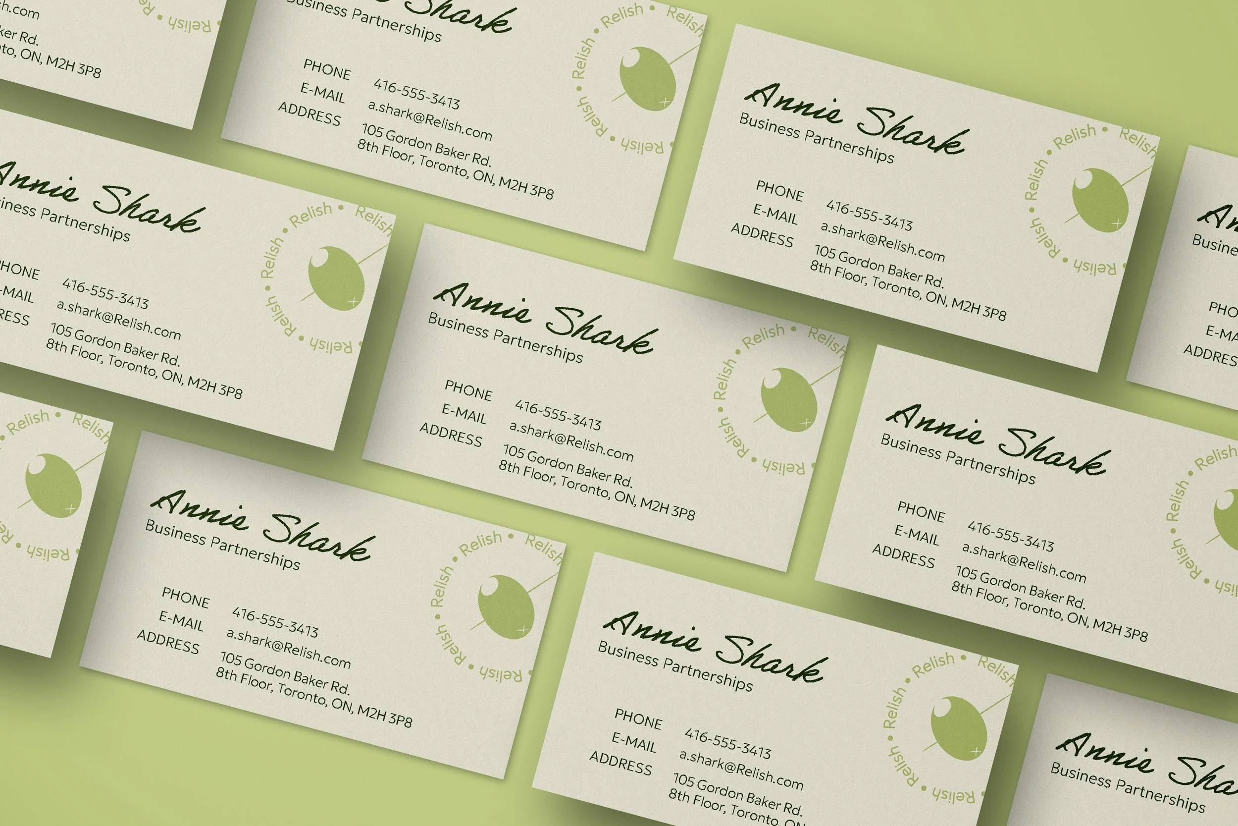
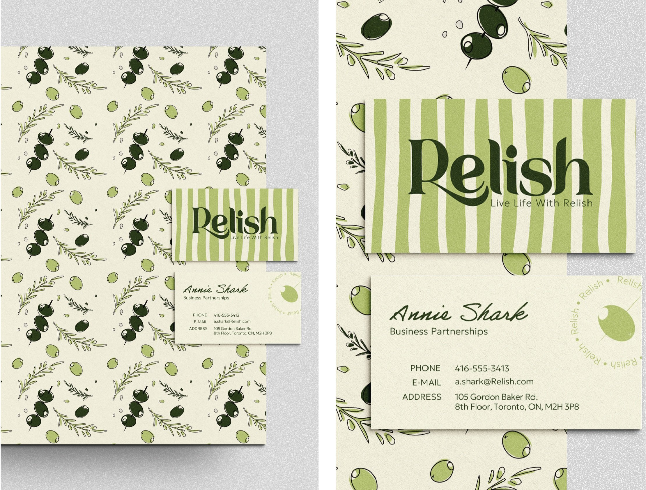
The scope included logo design, typography, color system, supporting iconography, patterns, and visual direction across digital and broadcast applications.
-
The brand needed to redefine eco-conscious living for a modern audience.
Sustainability has historically been associated with fringe or “granola” culture, often alienating style-driven consumers. The challenge was to present environmentally responsible living as aspirational, sophisticated, and seamlessly integrated into contemporary urban life.
The identity had to feel:
Elevated but accessible
Stylish without being exclusive
Warm, celebratory, and inclusive
Contemporary across multi-platform applications
-
The visual identity balances organic softness with modern refinement.
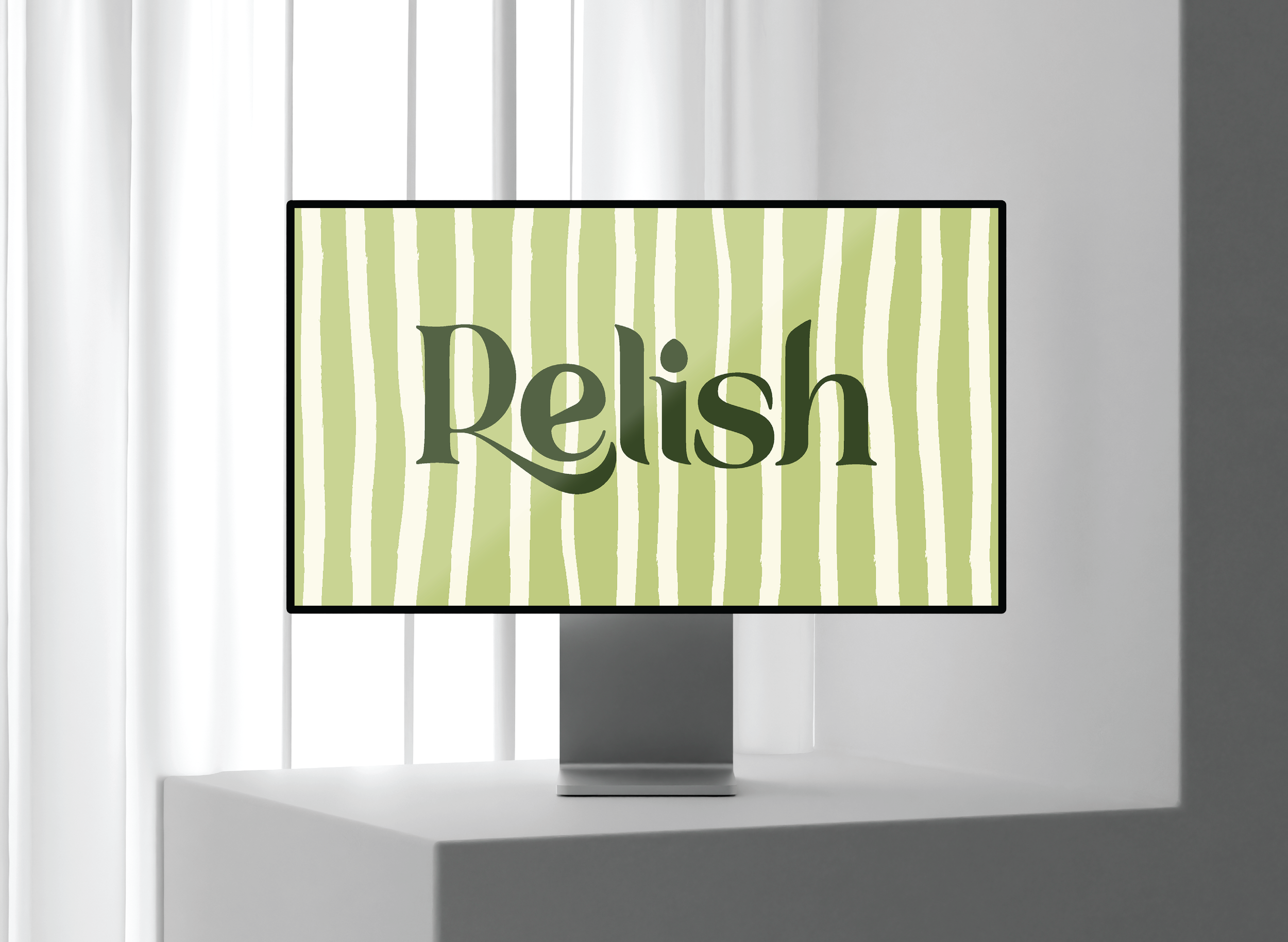
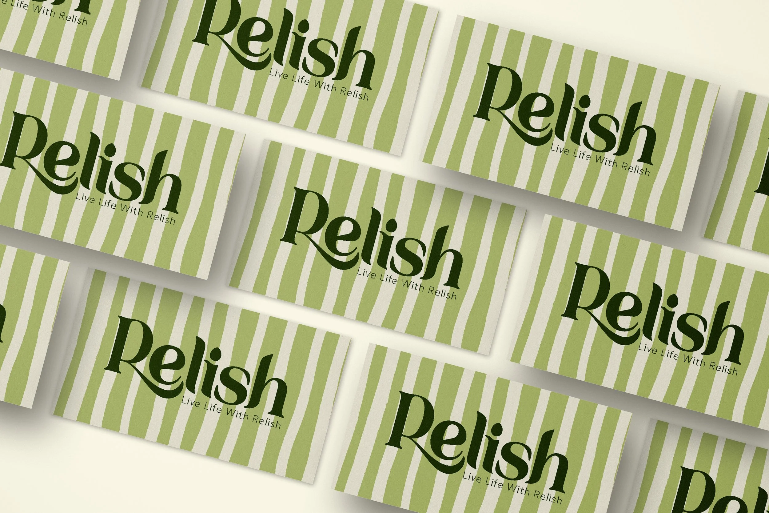
The logotype features flowing, elegant curves that suggest growth and natural movement, while maintaining a clean, contemporary structure. This contrast reflects the brand’s core message: conscientious living without compromising lifestyle.
A natural, muted color palette — mint, sage, warm beige, and deep olive — reinforces freshness and sustainability while maintaining sophistication.
Typography pairs expressive, slightly handcrafted forms with sleek geometric sans-serifs, creating a balance between artistry and intelligence.
Supporting elements, including a stylized olive icon and hand-drawn pattern system, introduce warmth and personality while remaining versatile across packaging, digital interfaces, and promotional materials.
The result is a cohesive visual system that positions Relish as a confident, culturally savvy destination for modern, eco-conscious living.